Building The Brand: A Step-By-Step Guide For Artists – FUXWITHIT
Branding is a double-edged sword extending far beyond an artist’s initial aim to grasp the attention of new-found fans. Although any project’s details should maintain cohesiveness to intrigue listeners, branding should also represent an artist’s personality and interests. This ensures the project is as authentic as possible. Rather than merely creating visual details to only allow one’s work to become more marketable for mass audiences, all aspects of branding should provide listeners an immersive view into the artist’s mind and attractions as a whole.
As an artist manager, I believe branding should accomplish three primary objectives: Be marketable, unique, and relatable. When thinking of visual designs and color schemes to craft a marketable project, our human minds tend to over-complicate the process. We generally know what is on-trend and what sells well. The tricky part is allowing the branding process to be personal while finding ways to relate with one’s target audience. To aid, here is my branding process as an artist manager: One I have used for my clients and outside artists who ask for assistance.
Allow me to lead with this statement: Advice is entirely subjective. There is no one pathway to success and no definitive process that fulfills every artist’s needs or aspirations. So, bear in mind, there are many ways to create the foundations for a brand identity. This is the process that works for me.
For the sake of this piece, I will be creating a mock brand identity, step by step, with picture examples. All example layouts are bare-bones, so to speak. Each following asset will look entirely different for every artist. Feel free to pull inspiration from this base example and adjust it accordingly.
Personality
Before narrowing down font types, textures, logos, and color schemes, I start by taking detailed notes on the artist’s overall personality and target audience. This is perhaps the most critical aspect of my creative process as, although the visual areas need to appeal to specific fan bases, branding without personality may become wasted efforts. I want the artist to fall in love with the foundations of the identity because it represents who they are as a person. With proper execution, you can make almost anything marketable, so I wholeheartedly believe in the importance of finding a happy medium between interests and character.
I start by studying my conversations with the artist and noting how I, an outside party and initial fan, views them. This includes questions such as:
- What are the artist’s interests outside of music?
- How do they usually dress?
- What are their communication styles?
- Who are their favorite graphic designers?
- What are their occupational interests?
- What makes this artist unique?
I find it is most useful to notate and lead with the design concepts an artist is most drawn to. Turning close attention to their favorite brands and graphic designers, I locate any common similarities. An artist can be extremely outgoing and humorous with a colorful personality but may find themselves frequently drawn to dark art themes and classic horror films. In this case, I would focus primarily on building the details according to their interests before finding ways to marry in their colorful character.
Most of the time, their interests already reflect their personality and sound preferences. Again, every artist is wildly different than the next, and the approach will always vary.
Moving forward with this information, I begin creating a very general color scheme and aesthetic. I then compile these surface-level aspects of the brand into a written overview, ensuring I am as detailed as possible. Here is how this written draft identity may appear:
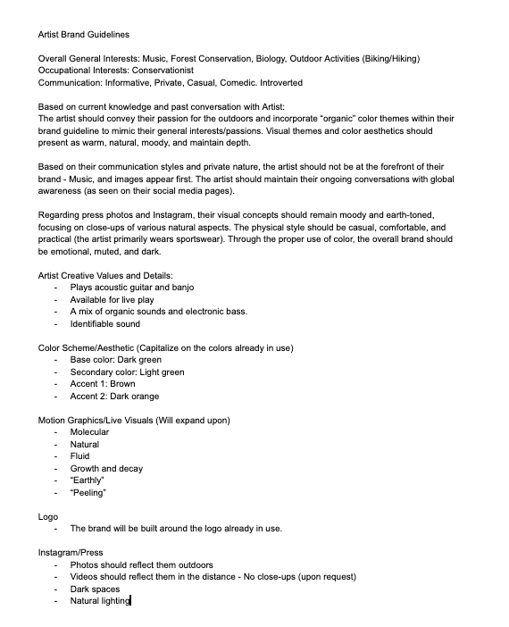
If you are beginning this branding journey alone, remember to be honest with yourself. I have worked with artists that are very particular about what they are looking to achieve visually and others that allow me full reign of the process. If you already have an end goal of how your project should be perceived, include those details as well.
Creating The Mood Board
Once I receive the artist’s approval on the written guideline, I begin creating the mood board by color scheme, personality, and interests. Using the above example of the written brand identity, I recognize the artist is secluded and prefers the outdoors. This artist also dresses in sportswear and enjoys activities such as camping, biking, and hiking. Additionally, I find this artist chooses to be alone most of their time and is honest about being uncomfortable in front of a camera. I take all of this information into account when fine-tuning design themes.
With this general understanding and a written overview to refer back to, I turn to Designspiration for the mood board. Designspiration allows me to search not only by image and concept but color code as well. The mood board can always undergo edits to reciprocate any artist’s evolving interests.
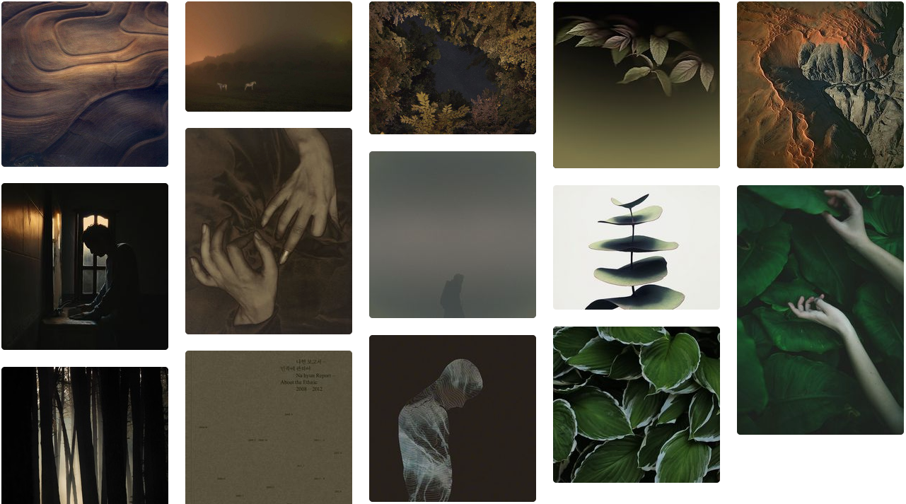
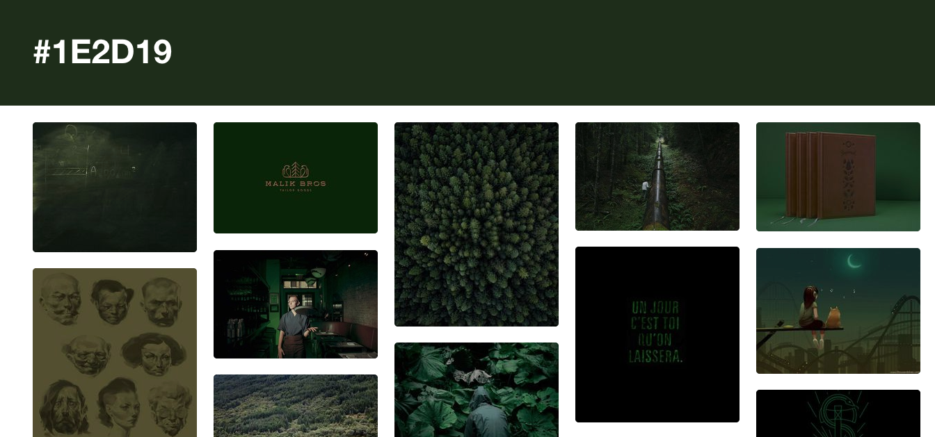
I personally believe a mood board is crucial. This acts as a physical and changing asset that highlights the brand’s direction over time. I have sent out a mood board to graphic designers and visual artists on multiple occasions when commissioning projects. This ensures anything I choose to outsource will come back to me looking cohesive, following brand guidelines.
Color Codes
Following the mood board, I narrow down colors and their corresponding codes to start building the physical brand guideline. I turn to htmlcolorcodes.com to create and notate this information. This site allows me to customize color selections and make a palette to the artist’s liking. Additionally, due to Designpiration’s unique color code search capabilities, I may choose to seek inspiration in the board’s reoccurring themes and grab codes from there.
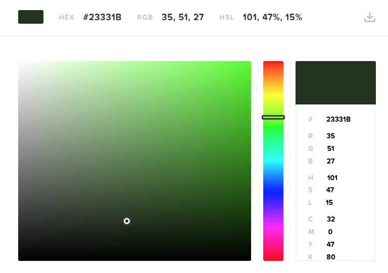

There are two reasons I find this important when creating a brand guideline for any of my artists. Firstly, the palette allows me to focus on the brand’s overall color schematics as they appear side by side. This offers me the chance to locate colors that contrast one another and may perform on their own while still appearing cohesive. Secondly, when outsourcing, rather than the commissioned designer guessing the requested colors’, they have the exact codes and color examples available to them for seamless application.
Typography
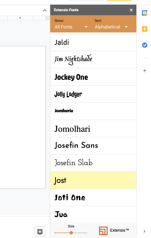
Regarding typography, this is entirely your own decision. I have worked with artists that use a custom font, others that choose one according to their personal likings, and others that find one closest to their logo’s font.
If typography selection is new territory for you, I recommend utilizing a free Google Drive extension known as Extensis Fonts. Once active, you can browse through their selection and find one that you enjoy.
Physical Brand Guideline
The physical brand guideline, in my opinion, is equally vital to an artist’s EPK. It gives my team a clear concept of what we are looking to achieve moving forward and is an important asset to share when commissioning projects. Although simplistic in format, it is the primary foundation when building all visual aspects pertaining to the brand, including but not limited to, cover art, promotional videos, live visuals, and physical merch.
For the birth of the physical guideline, I prefer using Google Slides. I begin by creating a simple on-brand cover that incorporates the artist’s base color, logo, and typography selection. The remaining pages will stay white. All of these details will carry over to the EPK creation.
Overall, there are three main points I like to convey in the brand guideline: Logo, color, and font, with color being the most important. For each objective, I provide examples. Again, this is an elementary example of what a brand guideline may look like. Both of my current artist’s approaches look wildly different from one another as each contains asset information particular to their brand. You may choose to include art examples (brand expressions), typography downloads (if using a custom font), logo exclusion zones, etc.
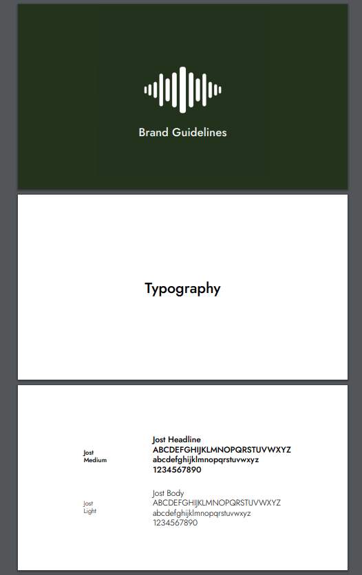
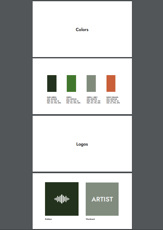
These are the base points I start with to keep it clean and simple. Alongside the mood board, I use a brand guideline almost immediately when working on a project. Because every aspect of my artists’ brands needs to stay cohesive, record labels, VJ’s, graphic designers, and photographers will all receive this.
Upon completion, I download this in PDF format and save it to a ‘Brand Assets’ Google Drive folder for quick sharing.
Electronic Press Kit
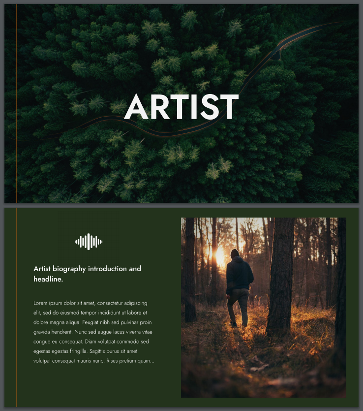
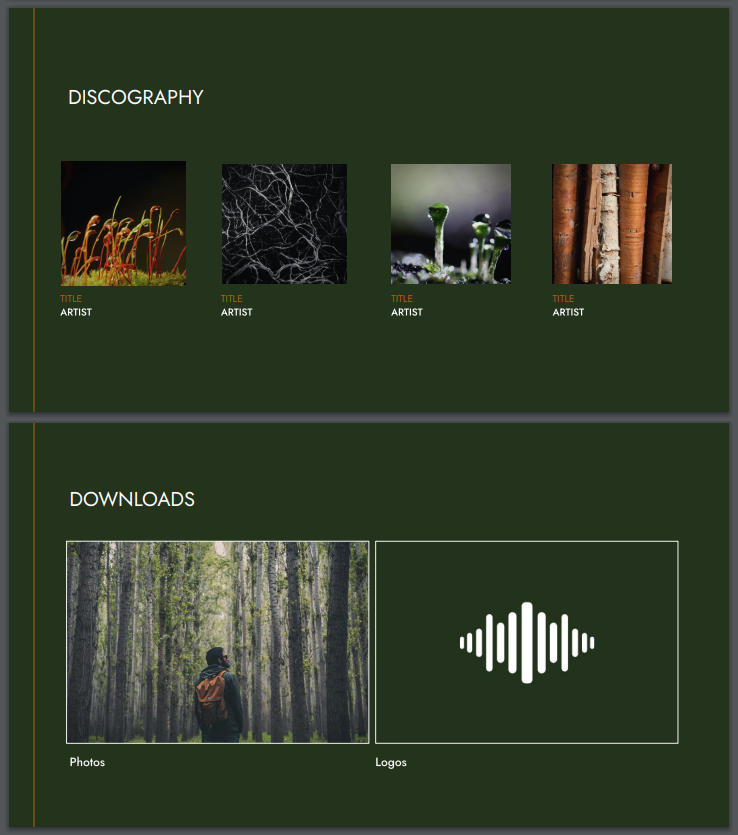
As a writer, I am more intrigued by a project when a press kit is interactive and on-brand. It is the first in-depth representation of a project outside sources, such as press and labels, may view. Once again, utilizing Google Slides, I combine all viable assets into a one-page downloadable scroller with links to individual drive folders for seamless access and organization.
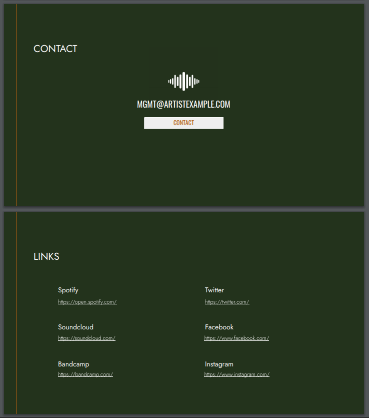
Using the same color codes and fonts from the guideline mentioned above, I create a 6-7 page EPK. This may include a cover, discography, biography, press downloads, social links, and a contact link. This layout will give outside sources a one-stop know-all about the artist and their brand while presenting as professional and marketable.
Once in awhile, I come across truly in-depth press kits that will include a press release from the artist’s most recent work alongside that release’s promotional assets. Additionally, I have seen embedded YouTube links to the artist’s current sets, streams, music videos, and or interviews. When creating your EPK, think of what you want the viewer to know about your project as a whole and arrange those details accordingly.
 Asset Use
All of the artist’s brand assets are filed into a ‘Brand Assets’ Google Drive folder (all masters are saved separately for quick edits).
For me, this process spans over roughly two to three weeks to ensure everything is perfect, down to the smallest detail. Given the amount of effort I pour into creating the necessary foundations of the project’s identity, I use at least one of these for every contact pertaining to the artist. And I fight to keep it as cohesive as possible moving forward.
I believe the most challenging area of branding is not the creation but instead maintaining these details over time. If my artist signs to a label, I request our team retains full control of art assets working within their preference template. If the label refuses, I fight to ensure their art delivery follows brand guidelines. When scheduling press photos, I send the mood board, guideline, and EPK to the photographer while scouting locations according to brand aesthetics. Motion graphic designers and VJ’s receive all of these as well.
Bringing It All Together
With similar target audiences, my current clients found visual inspiration in different mediums such as film and graphic art. One other artist I worked with found inspiration in contemporary pieces and nature. Their individual guidelines are far different from each other and serve different purposes for their growing fan bases. Just as my artists’ assets appear far more detailed than these image examples, the branding process is not meant to move in quick-pace. Although these foundational basics take only a few weeks to complete, successful branding requires long-term patience and active application. Take your time and be forgiving with the journey as well-thought-out details will perform far better than haphazard decisions. Time and attention to detail will matter when manifesting your brand identity.
 Asset Use